Showing posts with label Neutral Rooms. Show all posts

Monday, February 25, 2013

Benjamin Moore's Best Beige Paint Colours Part 2

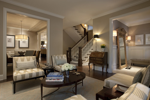
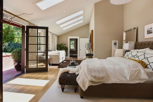
Benjamin Moore HC-26 ~ Monroe Bisque


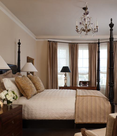
Although many of today's homeowners are opting to paint their walls in trendy shades of grey, there are still those of us who love the natural warmth of a beautiful beige.

After receiving such a positive response to my original post: Benjamin Moore's Best Beige Paint Colours, I decided to share a few more of my favorite BM beiges.


..........


..........


..........


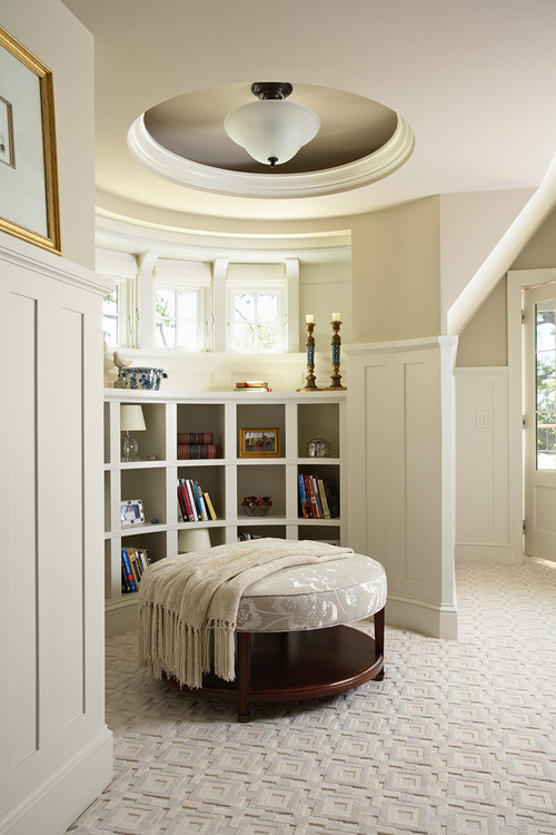
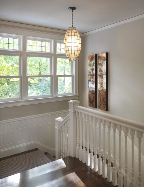
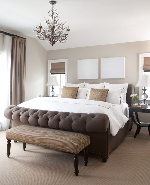
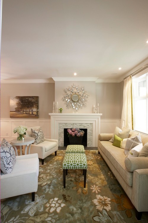
Each with their own unique undertone, these light to mid-toned beige paint colours create a soft and inviting backdrop for both modern and traditional design styles.

Did you spot a shade of beige that you think would be the perfect colour for your own home?

~ Wendi ~ xo

Saturday, February 16, 2013

Benjamin Moore's Best Beige Paint Colours

Benjamin Moore HC-79 Greenbrier Beige ~ Jane Lockhart interior Design

I love the warmth and beauty that beige brings to a design scheme.  The perfect beige creates an inviting glow in a room.  When chosen wisely, beige is anything but boring!

Here are just a few of my favorite beige paint colours from Benjamin Moore with green or red undertones:

Greenbrier Beige is a mid-toned neutral with a subtle green undertone.  It looks amazing with dark floors and white trim.

..........


Shaker Beige is another mid-toned neutral.  It has an equal balance of grey, green and red undertones, and reads like a "true" beige.  Shaker Beige is a BM favorite.

..........


Grant Beige is a grey based beige with a slight green undertone.  This colour appears much warmer in a south facing room or under incandescent lighting.

..........


Clay Beige is a light-toned neutral with green and red undertones.  It looks beautiful with browns and blues.

..........


Muslin is a luminous, grey-based beige with red undertones.  It looks lovely in a room with cherry or mahogany wood and silver accents.

..........

It's important to consider what colours already exist in your furnishings and flooring when choosing a neutral paint colour.  Lighting can also influence how the colour will look in your room.

If you want to create a soft and sophisticated atmosphere, these tried and true BM paint colours are a great place to start!

PS ~ Sorry for the looooong absence, and a big THANK YOU to all of my wonderful readers who've been checking in on me! It's great to be back!

~ Wendi ~ xo

Sunday, July 22, 2012

Bedrooms Designed with Serenity in Mind


Do you have a BEDROOM you long to spend more time in... a tranquil retreat that calls to you at the end of a long day?

These soft and serene master bedrooms are decorated in soothing NEUTRAL SHADES... ideal for a space dedicated to rest and relaxation.


There's a definite calming effect to these subdued and sophisticated BEDROOMS.  Each one is beautifully designed to quiet the mind and rejuvenate the soul.

I suddenly want to spend Sunday in bed... what about you?


Friday, July 8, 2011

A Light Yellow with Luminous Style


I recently began the illuminating exploration of YELLOW while selecting a paint colour for our newly finished basement.

This primary hue, known for its reflective qualities, seemed the obvious choice for a space with limited windows and low ceilings.

I soon discovered that a yellow that appears ideal on the paint chip, intensifies dramatically once it's on the wall.  Not only is the colour much brighter because of its ability to reverberate and magnify light, the tonal value is altered as well.

Thus began my search for a soft, sophisticated YELLOW. 

When a muted YELLOW is added to a predominantly white room, the effect is calm and soothing.  This near-neutral shade offers the feeling of colour without an extra sense of weight.
 

These luxurious window treatments add a dimension of light and movement to this tailored space.  Their tonal value is deftly repeated in the sofa fabric and patterned rug, sustaining a visual continuity and flow.

Although restrained and elegant, the creamy YELLOW colour scheme creates a warm and welcoming atmosphere in this tastefully decorated foyer.
 

This classic kitchen is flooded with natural sunlight.  A clear, vibrant YELLOW would be overwhelming in this space, but a less stimulating, muted ochre achieves the perfect balance of light and energy.


A space without the benefit of sunshine requires only a whisper of YELLOW to appear golden.  This creamy white paint with its subtle yellow undertone emulates the gentle glow of natural, diffused light.


Through my research, I've learned that YELLOW has the natural tendency to magnify it's own intensity and change its tonal value according to the surrounding light conditions.  Because of this, paint chips are often deceiving, making it difficult to identify its true chroma and tone.

And while the search for that perfect YELLOW was a challenge, the final reward is a soft and sophisticated space that exudes warmth and positive energy.     

No sunglasses required.


Saturday, March 12, 2011

The Benefits of Embracing Beige


One might compare the colour BEIGE to a wallflower; quiet, unassuming, and willing to disappear into the background while others more deserving shine in the spotlight.

And that is exactly why the majority of the walls in my home are painted a soft, demure shade of BEIGE.

The walls virtually recede, allowing the artwork, furniture and accessories to take center stage.

This is an example of how I used BEIGE in my library. The black desk, abstract artwork, and blue drapery panels and accessories make the clear design statements in the room.


Here are some examples of designer rooms incorporating neutral (BEIGE) backdrops...


The artwork pops against this room's simple wall colour...


I love the touches of yellow in this room. The neutral walls and furniture anchor the space, creating a soft and sophisticated palette...


When a room isn't saturated in colour, the addition of colour through soft goods and accessories can be better appreciated...


The use of BEIGE in a room does have its benefits. When colour, texture and personality are added through other design elements, the results can be amazing.

This is only one way to create a colour design story. It just so happens to be MY way.

Your personal tastes and preferences will be the keys to creating a home that best represents YOU.